Kool Kollectibles content

24 Aug 2013

Lego 21103 Cuusoo #004 Back to the Future set

Hey all, I finally received by order of the Lego 21103 Cuusoo Back to the Future set! And as the first Back to the Future collectible I've owned, I'm loving this little set!! :)

I was very excited when this was announced quite a while ago, so was keeping track of released dates and potential retailers. But as the release date drew near, I still didn't really know who I could order this from! The official Lego site had this for around $100 shipped to Australia, which really was a little too high for this item.

But luckily, a friend and follower of the Kool Kollectibles Facebook page posted that he had ordered from a UK online retailer called Zavvi for about $60 shipped to Australia. Still pretty expensive, but a lot cheaper than the official Lego site and ebay prices! So I jumped on and ordered immediately!

And after about 10 days, it arrived very nicely protected and packaged for shipping. I was definitely glad to finally get it in and see if it lived up to the hype!

The box art is pretty nicely done, and seems slightly better quality than the standard Lego sets that are released. But at this premium price range, that should be expected!


The back cover art shows off the three variants of the Delorean that can be built. For me, I stuck with the classic version from the first movie, although changing to the other variants is quite easy and simple.


Normally Lego releases comes with a sticker set, but I was definitely glad that this BTTF set does not, and all the decos are tamped on, so no fumbling around trying to get stickers perfectly straight!

I love how they changed the date so reflect the date the first Lego brick was produced. Nice little touch there by Lego!


Another point of interest is the mis-spelling of the word "shield" on the flux capacitor. Apparently Lego have been recalling stock to correct the piece, so I've been told to hang onto this piece as it might become a rare collectors piece one day! Strange, because that never even occurred to me! I was simply going to email Lego and ask if they could send me a replacement piece since I heard they are very good at doing that with customers. I'll have to wait and see how that turns out :)


The build itself is not too difficult, and took me just on an hour, but should be quicker for more experienced Lego builders. It's enjoyable without being too frustrating, and the end result looks great!


Some reviews have said that the design could've been more streamlined and less blocky, and perhaps could have been a larger scale. But I actually like a lot of the design elements they used and makes it quite flexible to modifications if you're so inclined.

The scale suits the included Doc and Marty mini-figs, and they do fit in sungly inside the car. I love that the doors swing up as they should, and the use of hinges is nice on a lot of areas in the design.


The Delorean looks sweet from pretty much all angles except perhaps directly front on. The side and rear views are the best, showing a lot of the little details that they included.


I love the classic number plate, and they also include the variant plate from the second movie where it turns into a barcode. But the OUTATIME plate is pure classic, so that's how mine will stay :)


The wheels are rubberised, which is pretty standard for Lego vehicles these days (I would love if Kreo did that too!!) Overall, I love that I have this little set in my collection now. It looks great on display with Doc and Marty, so if you can find one in stock for a reasonable price, I'd just straight on it! It seems to be selling out quickly wherever it is listed, so get in while you can!!


I also did a video review up on the Kool Kollectibles youtube channel, so check that out if you can! Like, comment, subscribe!! Talk to you all soon! ;)


12 Aug 2013

Kotobukiya ArtFX+ New 52 Justice League Batman statue

The last Kotobukiya ArtFX+ New 52 statue I received, that are currently available, is the Batman statue. And wow this New 52 design is AWESOME!! I'm not sure what all the fans are complaining about! I think this costume perfectly blends the classic with the modern, and makes for a beautiful suit in its detailing and colour.

The head sculpt has some clear anime influence to it, and the cowl and overall head sculpt is beautifully done. The metallic silver on this suit is amazingly done by Kotobukiya, and is the stand out feature on this statue. I love the new lines and pattern on the New 52 suits, and this paint app simply brings it to life.


The pose is simple on this one, which suits the character pretty well. And I love the way the cape flows back over the shoulders and doesn't come too far forward of the arms. That look was fine for Keaton Batman, but this new character needs to show off that suit!

The gauntlets on this statue are also amazingly detailed and painted well. With the shiny boots, the black here accentuates the silver in a very classy way.


As with the others, again the statue looks incredible from all angles. These statues don't just have one hero angle, but look perfect no matter the viewing direction. As you can see in the above photo, the cape drapes beautifully over the back.


And did I say the cape was beautiful? I mean just LOOK at that sculpting!! I know it's just a cape, but the way they've sculpted the elegant flow of the cape, the figure also looks amazingly awesome and ominous from the rear view. It's done with a softer plastic material, but be careful when moving around as those sharper points in the cape may break off if you bump it against something.


Again the statue comes with a magnetic base and magnets in the feet. The statue feels very secure and stable on this stand, perhaps with the additional and evenly distributed weight of the large cape. The stance is quite wide too, which helps with the stability.


Overall, this Batman is my favourite among the six New 52 statues so far. Sure the paint app isn't as amazingly in-your-face beautiful as the Flash or Aquaman, but this one is a little more subtle in its awesomeness. The silver shine, and amazing detail in the gauntlets along with the deep metallic blacks, coupled with a beautifully sculpted cape, really make this statue the standard bearer in an already stellar lineup! It gets my highest recommendation!

Check out the Kool Kollectibles youtube channel video review below!


Kotobukiya ArtFX+ New 52 Justice League Wonder Woman statue


I don't have many female characters in my collection, but if you're going to start, what more iconic character could there be but Wonder Woman! I watched the Lynda Carter Wonder Woman TV show back in the day, but like so many other of the Justice League characters, it's been about that long since I've really read or known much about their stories.

There's been a lot of controversy over the New 52 character design changes, and none more so than Wonder Woman. Before the #1 issue of the New 52 comics, it was revealed that Wonder Woman would sport a new suit with pants, and not her iconic bikini.

I guess the fan outrage was heard, because I believe prior to the release of the first issue, the cover art was changed to revert her back to a bikini. Thankfully this Kotobukiya ArtFX+ New 52 Wonder Woman statue retains her pants-on look, which I totally prefer.


I'm not one to be prudish, and love fan service as much as anybody (gratuitous Chun Li shower scene excitement anybody?) But on Wonder Woman, I think this suits her fine. The costume, coupled with the simple and stern pose and facial expression, make for a hero to be reckoned with, not one to be perved at. Maybe I'm just showing my age, but this version just seems more kick-ass to me than one jumping around in a bikini.


The sculpting is very nice, with delicate features in the face and gorgeously sculpted hair. There's no slop in the paint work, although the skin tone may be a touch too pale, with her being an Amazonian warrior and all. Regardless, she still looks beautiful to me.


As with all the others, the statue looks awesome from every angle. The sword  and golden lasso are done very nicely, but are only attached to the body by very thin plastic or glue. I would be very careful in handling these areas as the items might break off. But the paint app and detailing on them is awesome.


As with the others, the statue comes with a magnetic base and magnets in her feet. The only real complaint that I have with the statue is that the feet are not fully planted, and so it's not as stable as her other Justice League counterparts. The others feel more stable with a flatter stance, so this is another area to be careful.


Overall, this is another sensational statue released by Kotobukiya. The dark blues, reds, and silver highlights look stunning, and the detailed pattern on the suit really bring the quality of this piece to the fore. Of all the female superheroes around, I'm definitely glad Wonder Woman is the first in my collection with this great piece.

Check out the Kool Kollectibles youtube channel video review below!


Kotobukiya ArtFX+ New 52 Justice League Aquaman statue


I remember watching the Aquaman cartoon back when I was a kid in the 80s, but that was pretty much the last exposure I had with the character. But opening this awesome Kotobukiya ArtFX+ New 52 Justice League statue just makes me want to get back up to speed on all these characters.

Again the head sculpt has the anime influence, which is a little strange coupled with the flowing sideburns down his face!! But the look actually works and the hair sculpting really brings out the visage on this one too.


But it's the paint app on his body that is the shining feature here (pun intended)! The scales on his upper body are really brought to life by an amazing gold/orange/yellow collage of colour that almost changes before you eyes as your rotate the light around it!


Couple that with the awesome dark metallic green similar to the Green Lantern, and the figure absolutely pops on the display shelf! In fact, this rivals the Flash as the stand out paint app in this line of statues so far for me. The sculpting for the fins is nicely done too and give the statue some really nice accents around the arms and legs.


It comes with the usual magnetic base and magnets in the feet, which hold him firmly in place even with the trident stretched out. The pose is purposeful and not overly dynamic, perfectly in line with the others in the series.

As you can see, the statue also comes with his iconic trident, packaged in two pieces that you connect up and then slide into his hand. The trident is plastic (I was hoping for it to be metal!) but still looks OK with a decent paint job.


So again, Kotobukiya has knocked it out of the park with this statue. The paint app on this is just as amazing as the one of the Flash, giving the statue a very lovely shine under all lighting conditions. It really looks amazing on the shelf.


I definitely recommend these statues. Sure they're not articulated figures, but with awesome sculpting and amazing paint application, these more than make up for that!

Check out the Kool Kollectibles youtube channel video review below!


Kotobukiya ArtFX+ New 52 Justice League Flash statue

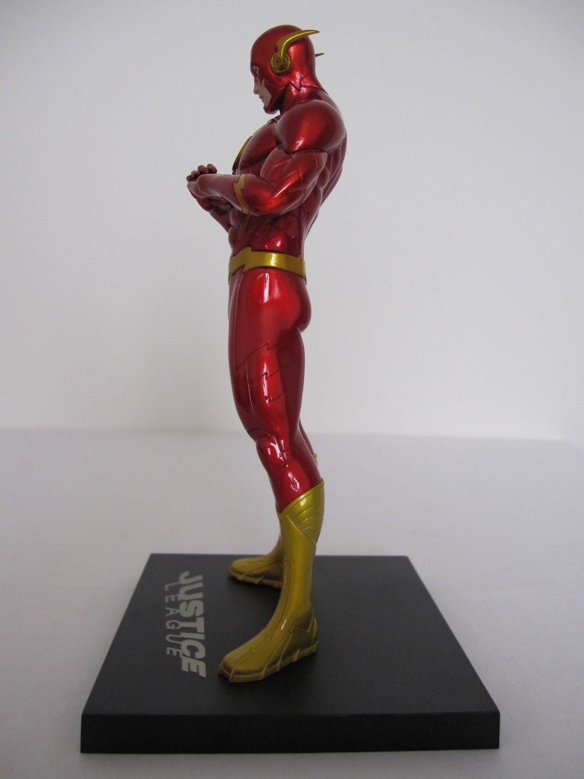
When you first open up the Kotobukiya ArtFX+ New 52 Flash, you're pretty much astounded by how amazing the dark metallic full body paint finish looks on this statue! Well at least I was! I think overall, the paint app on the Flash statue is the best in the series, and makes him stand out from the rest. The way the light reflects of the suit is dazzling!

The head sculpt is again anime influenced, but perhaps not as noticeable due to the helmet. The gold wings on the head are very nicely done in a rich gold, but I'd be careful because they appear to be quite delicate and could easily break off. The paint around the face and eyes is very nicely done too, with no slop to detract from the delicate details around the helmet and face.


I really like the pose on this one, with a serious but playful fist-in-palm look. It looks sensational from every angle. The flawlessness of the deep red paint and the musculature sculpting is an awesome mix on this one. With so much red, the paint had to be flawless, and it is.


I love the deep gold accents too around the waist and especially the boots. I find the mold on the boots particularly good, with precise and great looking patterned lines. With this mix of dark metallic red and gold, from some angles he could be mistaken for Iron Man!

It comes with the usual magnetic base and feet that keep him pretty firmly in place, but allows for flexibility in poses within the team.


My only real background with the Flash character was from the TV show in the 90s I think. I actually enjoyed that series, but can't remember too much about it. I'm definitely glad to now have such an awesome representation of the character in my collection!


It's amazing how colour really changes the look of a display. A lot of my collection is dominated by dull and dark blacks, browns, and greys. But with this New 52 Justice League series, particularly this amazing Flash, the shelf now simply looks so much more alive with the burst of colour.


This Flash one of my favourites from the New 52 series of statues so far, thanks to that amazing paint app and fun pose. Just looking at him and the rest of the team on the shelf, it amazes me how I could have waited so long to get them! Definitely glad to have picked them up now at a reasonable price!

Check out the Kool Kollectibles youtube channel video review below!


Kotobukiya ArtFX+ New 52 Justice League Green Lantern statue

 Just like the Superman statue, the Kotobukiya ArtFX+ New 52 Green Lantern is a great representation of an iconic superhero. The sculpt is again designed by master sculptor Goutaro Takeuchi, lending an anime style to the facial expression. In fact, I was starting to get confused with the Green Hornet Kato character for a bit there :)

The paint on the face and mask is nicely done, with the skin tone not overly pale or tanned. Again the hair is well sculpted and finished. Overall, the statue certainly looks great on display!


The pose again is fairly subtle and not overly dynamic, with the ring on the fist giving a nice punctuation to the stance. The metallic green is very nicely done, but the figure doesn't stand out as much as Superman mainly due to the matte black finish on the rest of the suit. It would've been interesting to see what the statue would have looked like if they had finished the black in a metallic shiny finish like the other statues. Perhaps that might have been a bit to "bright", so they went with the matte finish instead.


Again, the statue looks great from all angles, with the body proportions being a little better than the Superman. The legs and torso section seem to match better in this statue.


The musculature on the statue is great, as they are on all the New 52 statues. The lines and patterns on the suit are again done very precisely. Mine had a minor blemish on the chest area with a bit of black paint splash, but it's tiny so I wont bother trying to remove it.


As with all the statues in this range, it comes with a magnetic base and magnets embedded in the feet. Really nicely designed, non-intrusive, and flexible in the display options, so definitely a win-win there.


The Green Lantern is certainly not one of the superheroes I'm most familiar with, with most of my focus being around Superman and Batman. But this figure is so amazing that now I want to go back and look into the character's history and origin. I don't have an opinion either way on whether the New 52 is better or worse than the classic comics, but I do know I love this new representation in at least an aesthetic way. Displayed individually or together with his Justice League brethren, the statue is a highly recommended collectible!

Check out the Kool Kollectibles youtube channel video review below :)


Kotobukiya ArtFX+ New 52 Justice League Superman statue


The Kotobukiya ArtFX+ New 52 Justice League Superman statue I think captures a great mix of the classic, iconic look with the modern touches in fashion now. There was a lot of controversy over the New 52 costumes, but I think they look great. Of course it helps that the Kotobukiya statues have amazing paint apps that really make the costumes shine and stand out on display.

The head sculpt is quite good, with a more serious visage that I prefer to any of Superman smiling. The hair is sculpted nicely, and the facial paint app is quite good. Eyes are always difficult areas with lots of paint slop around the eyes and face, but Kotobukiya have done a nice job here.

The pose they've selected for the statue depicts strength and an inner purpose without being too over the top or dynamic. Pretty much perfect as the point figure in a Justice League group display.


The lines and patterns on the suit and boots accurately capture the New 52 look, and are done very precisely with no colour bleeding. The muscular sculpting is also done nicely, without the overlay buff look that can sometimes affect other anime characters. The iconic "S" on his chest is done very nicely, with a nice gold colour used too.


The statue looks great from pretty much all angles. If anything, the only thing that I could fault would be perhaps the overall body proportions in the legs. I actually find the legs are a little short, particularly when compared with the other males in the Justice League team here. It may be because the red belt is placed a little low on his hips causing an illusion of shorter legs, but I think it would've been slightly better raising the belt or making the legs a little longer or making the torso slightly shorter.


Still, even from behind the statue looks amazing. I really love the way they made the cape look, with a natural drape coming to a point in the middle. The symbol is painted on well and looks nice against the red.


The magnets in the feet work really well with the magnetic base to add some flexibility in placing the statue on the base. This works particularly well when posing the entire team together, where you can move the statues closer together or change their orientation slightly while still using all the bases lined up together.


With this statue, either up close or from a normal viewing distance, you'll be extremely happy with the quality. The metallic blue is a perfect hue, and you really could spend a lot of time just staring at it :) If some company was able to make an actual articulated figure with a similar paint app and a wide range of articulation joints that weren't too obvious, that would be amazing. But until then, I think this statue is a great representation of the New 52 Superman and will be a welcome addition to any collection!

Highly recommended! Check out the Kool Kollectibles youtube channel video review too below :)


Kotobukiya ArtFX+ New 52 Justice League statues!!

Well, I'd been on the fence about the Kotobukiya ArtFX+ statues for a while now, since I was trying to stick to action figures only. I do like to change up the poses in the display every now and then, so the poseability of action figures is something I prefer.

And for the New 52 Justice League, I was actually very close to ordering the DC Collectibles "We Can Be Heroes" 7-pack of action figures. But online reviews pretty much showed that they had limited articulation and were pretty much statues anyway.

So when Kotobukiya started releasing the New 52 Justice League team in their ArtFX+ range, with what looked to be some amazing paint apps, I was very interested! And then recently they announced the ArtFX+ Avengers series of statues for 2014, so with that I couldn't resist any longer. I went to a local collectibles store and saw the statues in person, and was pretty much convinced on the spot :)

The statues are packaged very nicely in clear transparent boxes that showcase the characters very well. So you could actually display them in the boxes without taking them out if you wanted, and they would still look awesome. The front view has a clear full body view of the statue with their classic named logos. Nice!


The side view also has their iconic insignia logos, which is a very nice touch I think. The box for Batman is the largest to cater for his flowing cape.


The other side of the box has some awesome artwork for each character, than when placed together combine for a larger mural of them all. You can see on the right the shoulder of the upcoming Cyborg statue, which should be reaching retail in either late August or early September. Can't wait to get that and complete the core New 52 Justice League team :)


I'm not exactly sure what material is used to manufacture the statues, but they are all fairly light weight and feel sturdy. Each statue comes with a magnetic base and magnets inside the statue's feet which gives some awesome flexibility in placing them on display, especially when grouped together. I much prefer these to the usual bases that come with action figures that have pegs.

But the best part of course is the metallic, reflective paint app on the statues themselves. The quality of the paint work is very high overall, with minimal slop and bleeding. The face sculpts all have an anime influence, which is understandable given Kotobukiya is a Japanese company and this is their master sculptor's Goutaro Takeuchi's interpretation of the New 52 characters.

How do they look out of the box you ask? Absolutely SENSATIONAL is how!! :) These look great in pretty much any direction, and in all kinds of lighting, although if you have lights that are better for reflecting or spotlighting (eg. downlights, LEDs), then these will really pop!


Stay tuned for a more detailed review, pics, and video on each individual statue! :)


1 Aug 2013

Testing my kid's collectibles knowledge, and them failing miserably ;)

Always great fun with the kids laughing, so I filmed them while I tested how well they knew my collection. They start off pretty well, but it all goes wonky very quickly! LOL!! :)


Gotta say that kid's laughter is definitely good for the soul :)

21 Jul 2013

My thoughts on Star Trek 4: The Voyage Home

Well, after the meandering pace of the first, the very good second, and the frustration of the third, I didn't hold out much hope for the fourth Star Trek: The Voyage Home. However, my memories of having watched ST4 as a kid were good though, with me remembering I really enjoyed it and thought it was funny! And now having just watched it again last night for the first time in 15 years, I can honestly say I think it's great!!! :)


I had no idea that Nimoy actually directed and co-wrote the story for this, and was surprised since I always thought he was a bit of a straight up serious guy. But this movie is just plain funny! Out of the 4 I've watched so far, this is the first Trek movie to not take itself too seriously! I know there are diehard Trekkies out there with their blood boiling over this movie, but I can totally understand why there is a large percentage of the general population that think ST4 is one of the best Trek movies - it's because it has some actual humanity to it, some irreverent humour, and just something we can all relate to!

The earlier Trek movies were so damn serious and esoteric, the average movie-goer just couldn't get into them! Too serious, with perhaps too much reliance on understanding the whole backstory and characters. Here in ST4, I think it was great that they grounded the story in the present (well, the 80s of the time). Who doesn't love a fish-out-of-water story, especially with this crazy crew?!?! :)

Obviously the best parts of the movie are those when the crew mingle about in 80s San Francisco. There were so many times where I just cracked up laughing! I mean, that "double dumb ass" scene below was pure 80s classic humour :) What about when Spock ties his headband on?!? LOL!! And the punk rocker and "dipshit" scenes? Loved them all!!!


On the whole, I think the acting by the whole cast was generally better than all previous movies. Earlier, they were all so serious in depicting their character traits, they just didn't seem normal to me. But here, the cast seemed more comfortable, and actually came across as a crew of friends. Splitting up the crew into small teams I guess gave each cast member some decent screen time, and they all looked to be having fun!

I think even pacing of the story was great. There was actually suspense built, especially the lead up to the crew returning to earth the first time, and then saving the whales. The way the plot was executed in this movie made me care more for the fate of the crew and whales than in the earlier movies!


Still, there are a heap of inconsistencies and conveniences that result in massive plot holes. I mean, you're trying to tell me a couple of people can just walk into a military area and somehow find their way onboard a frickin Navy vessel!?!? And Sulu just walking up to some guy working on a helicopter and climb in and chat away!?!? And just getting into some medical garb and barging in on a surgery past some cops!! And an invisible spacecraft that noone actually runs into in the middle of a park?!?! And everything seemingly happening  within a 24hr timeframe!?!?!

But despite all that, I still really enjoyed the movie!! I could put that aside because the movie didn't take itself seriously!! Perhaps that's the exact reason why so many diehard Trek fans hate this movie, and perhaps that's the difference between how the "average" person and the Trek fan see each other!

For me, The Voyage Home has actually made me want to watch the fifth movie, no matter how bad it might turn out! Somehow, I relate more to the characters now than from any of the previous outings. I mean, Spock had a "guess", the crew smiled and actually showed some emotion, and Kirk actually had some sexual tension with another person besides Spock!! :)

So yes, overall, definitely my favourite original Trek movie so far. I give it a 7.5/10! Recommended for the average movie fan :)

14 Jul 2013

NECA Jungle Disguise Dutch, Water Emergence Predator, and Jungle Encounter Dutch

Wow, these latest figures from NECA's Predator line has restored my faith! I was initially disappointed with their recent Aliens figures Hicks, Hudson, and Alien Warrior, but these new Predator figures are simply outstanding!!


Predator was one of my favourite action movies back in the day, so when these were announced, I just had to get them! And NECA did not disappoint. The paint app and detailing on the Jungle Disguise Dutch is extremely well done, and the headsculpt is pretty much as perfect a representation of Arnie as you'd get in this scale!

He is loaded with accessories, ranging from the bow and arrows, to the spears, to the iconic flaming torch he uses towards the end of the movie. The articulation is also very nice, with all the usual points of movement you'd expect from a high end 6" figure. The knees this time are not double jointed, but I prefer this with this one, since they make the figure look a bit more natural.


The Jungle Encounter Dutch is also an excellent figure. The headsculpt is great, but be careful of the eye paint app, which may appear to wide or too close together. Still, from a normal viewing distance, they look fine. The body is nicely done, and is not painted but molded in the skin colour, as is the head, which lets the other paintwork really stand out. He comes with 3 weapons, and the articulation is as great as with the Jungle Disguise version.


I already have one of NECA's older classic Predator figures, but this new one from the scene where the Predator jumps into the water and emerges to search for Dutch is just too kool to pass up!  The transluscent mold and electric blue paint apps are done beautifully, and the range of articulation is actually a slight improvement over the older Predator figures.


For a video review of all three figures, check out the Kool Kollectibles youtube channel review here:


Overall, I think NECA has knocked this particular wave right out of the park!! They come loaded with accessories, and look and feel extremely high quality! Definitely highly recommended!

5 Jul 2013

My thoughts on Star Trek 3: The Search For Spock

I actually enjoyed Wrath of Khan quite a bit, despite some pretty bad acting and general campiness. But wow, Star Trek 3: The Search for Spock ramps that up to warp speed and ends up being pretty much the epitome of bad 80s B-grade sci-fi fluff!!!


I would've thought that at least the special effects would improve, but they are bad even by early 80s standards!! I think they tried to make some more sophisticated camera pans for the spacecraft, but other than that the general puppet work, explosions, set design etc is all low grade. Which is a shame since I thought after ST2 they would've put a lot more effort into it!

But I can forgive special effect issues in this era. But my god the acting was just so BAD!!! I had no idea Christopher Lloyd (aka Doc Brown from Back to the Future) was in this, and he at times still channels Doc Brown, albeit in bad Klingon makeup!


Again, deaths in Star Trek simply do not seem to have any emotional impact on any one except maybe Kirk!! The whole damn spaceraft Grissom is destroyed, and David and Saavik dont even blink!!! I mean shit, you dont even panic or mourn the lost crew??

And the whole damn sequence when David dies is almost like an after-thought, with Kirk just mumbling some "damn yous", "bastards", and "you killed my sons" through some pretty bad forced crying!!


Not to mention the rest of the Enterprise crew. How they commandeer the Enterprise by attacking the guards etc is just so hilariously camp, forced, and just plain stupid really made a mockery of Starfleet. The "dont call me Tiny" sequence with Sulu was embarrassing!!!

The ending itself was a let down for me too, considering the effort the crew had put in to save Spock! Spock I guess was being.....Spock, a totally emotionless prick! No thanks, just a stoic face that even Kirk simply stares wide-eyed at when he remembers them. It just didnt connect with me at all.

So I am so disappointed in this follow up to Wrath of Khan! In fact, I even prefer the slow, meandering story of the first movie to this!!! I give it a 6/10 at best. Surely it can only get better than this right ;)

2 Jul 2013

NECA Aliens Series 1 - Hicks, Hudson, and Alien Warrior

Hey all, Khai here! It's been a while and definitely has been a slower second quarter this year. A lot of things I've ordered have been pushed back for release later in the year, but I guess that has helped me save some money! :) But recently I received my order of the first wave of the new NECA Aliens figures - Corporal Hicks, Private Hudson, and the Xenomorph Warrior!


They are pretty good, and have grown on me now that I've had a bit more time to pose them up! Check out my video review, comment, subscribe - you know the drill :)


Thanks, and will be back soon with more reviews!
Khai

1 Jul 2013

My thoughts on Star Trek 2: The Wrath of Khan

My Star Trek marathon this week continues, and tonight was Star Trek 2: The Wrath of Khan. And I really liked it!! After watching the slow burn to nowhere that was Star Trek: The Motion Picture, I wasn't expecting much, but part 2 definitely was a step up!


I can now see all the references to these original Star Trek movies that were in JJ's versions (eg. training simulation, radiation leak, ear bugs, one-liners etc)! And so many came from this one movie! This was the Star Trek I was expecting, upping the ante action wise. Although everything still seems to have a camp/corny feel to it, at least this movie seemed to be going somewhere!
 
I was totally surprised to see Kirstie Alley, but I guess she did a decent enough job. Her acting was no more wooden than a lot of characters in the movie! This is one area that still bugs me in the Star Trek movies (albeit I'm only into the second one!) - that all the acting just doesn't seem to have any urgency to it. I mean, the crew just survived an attack, and in the next scene you just see people slowly walking around or staring off into space! Where's the emotion, the fear, the desperation!?!? Well, I guess the crybaby sitting in the chair next to Kirk after the first attack was showing some emotion - I just cracked up when I saw his face!!
 
The only one that really showed any emotion was Kirk himself, and then it was still a little corny! I mean, when he screams out "Khan!!!", I couldnt help but laugh!!


It just seemed so out of place with everyone else just standing around. I mean, everyone in the scene didn't seem flustered at all about being stuck with no way to escape! Everyone just seems contemplative instead of scared or angry or......anything!!
 
I guess Khan as the villain was your typical 80s camp bad-guy, with the bad hair and strange dialogue! He certainly had a penchant for spitting out poetry - in some scenes I had to turn on the subtitles to make out what he was rambling on about! :)
 
At least this time the music score by James Horner was more space-opera than wild western style of Jerry Goldsmith's original score. In many ways it reminded me of the Star Wars score, which is always a good thing :) Unfortunately the special effects are still a huge step behind the standard of the original Star Wars trilogy. The original cut of Star Wars has effects that stick out badly now, but the ones in Star Trek 2 are even worse.
 
But despite all that, I thoroughly enjoyed Wrath of Khan! It has certainly picked things up nicely after the boredom of part 1, and was more what I was expecting when I started this marathon. For the most part, I liked the extra action, humour, and definitely the improved pacing. So for this, I'd give it a 7.5/10! Can't wait to see how they get Spock back :)


30 Jun 2013

My thoughts on Star Trek: The Motion Picture

Well, most of you probably won't believe this, but I have only just watched the original Stark Trek: The Motion Picture for the very first time. Our local retailer had the recent Star Trek 10 movie Stardate Collection on bluray at a discount price, so I picked it up the other day.


And now that I've seen the original Star Trek, I can totally understand why I've always loved Star Wars and not Star Trek since growing up as a kid!! Before any Trekkies flame me, let me explain! :)

Overall, Star Trek: The Motion Picture simply does not have the fun, action, or humour that Star Wars has in spades! It is just too esoteric for any kid growing up in the late 70s/early 80s to understand and enjoy!


I mean, the movie throws you in the deep end right from the start with the cloud attacking the Klingons, and not a word of English for the first 5-10 mins until the intro of Kirk! And the movie was just too padded out with:

- lengthy shots of the Enterprise moving inside the cloud.

- way, way, way too many closeups of the crew just staring out the viewer with all sorts of weird expressions on their faces!

- dialogue and body language that was simply not delivered in a natural manner!

The way people reacted to deaths, attacks, Spock etc was just too mechanical for me. Like when Spock first boarded the Enterprise, the reaction of the crew was just bizarre!

And the whole Voyager thing and the mechanism achieving its own consciousness etc - if I had seen this as a kid I wouldn't have known what the f*ck was going on!! As an adult, I'm still struggling with it intellectually!! :)

But there were some good points. I like the musical score, although it's certainly not as memorable as the Star Wars score. In fact, there were quite a few times I thought the music would be equally at home in a wild western movie!! I also loved that in the future, women still wear mini-skirts ;)

Overall, I left this movie feeling more intrigued than anything. So I'm itching to get into the second movie to see where it goes from there. Hopefully it's not such a meandering story but a little more focused. So overall for Star Trek: The Motion Picture, I give it 6.5/10 :)